CONJUNCTIONS, CONFLICTS & CHALLENGES
Planning The Hood Museum of Art
The crucial issues involved in the planning of the Hood Museum of Art surfaced before we became its architects. Even in early 1981, when several firms were being considered for the commission, there was considerable uncertainty about the site of the building. The Hood was meant to be next to Hopkins Center, working in close connection with it, but no site seemed ideal. In fact, I had been introduced to the problem a year before. Jim Sterling, the eminent British architect, had been teaching at Yale and he assigned the problem of the Hood to his students. I sat on the jury. It struck me that although many sites were available that suited the program, there seemed to be no relation between the site chosen and the excellence of the building produced in the student problem. Buildings that were placed on an eminently logical and correct site often lacked qualities manifested in buildings on less obvious sites.
When Dartmouth selected us, then, my experience as a juror had already persuaded me that there would be some virtue in not trying to make a highly organized decision about the site. It seemed best to hold a kind of architectural beauty contest, in which we took advantage of our capacity to produce schemes quickly. We decided to design a building for each of several sites and discover which was the most popular. The selection task was vested in a committee of about thirty people, representing the various groups with an interest in the building. It was guided with amazing skill and subtlety, I thought by Leonard Rieser, then the provost, and by Peter Smith, director of Hopkins Center at that time. We set up shop in a room right next to the Hopkins Center snack bar, at the center of comings and goings on campus. Our goal was to be, as far as we could, the opposite of mysterious: we wanted to be continuously available. We remained there for weeks at a time, working on alternative schemes and establishing ourselves as willing to talk. We welcomed the visits and intervention of anyone who was interested. This sustained receptivity is at the heart of our beliefs as architects, and I think it is one of our strengths. We are interested in listening, and in responding to people's images and ideas about the buildings they are to occupy.
Our procedure was to make schemes for six sites, which were then consid- ered by the committee. We were then asked to forget a couple of the sites and to make an alternative to another, so we ended up with five sites this time around. We projected buildings for each, describing them with plans and little models. We had people from our office by the snack bar turning out models at high speed. These were all examined, reconsidered, and rejected or accepted, until finally we were down to three schemes on three different sites.
The proceedings then began to resemble what I imagine a Republican convention must have been like in the 1880s. The museum's face onto the Green had always been an important issue in discussions of the site. We had one site to the right of the theater entrance of Hopkins Center, as you look at it from the Green, and one to the left, between it and Wilson Hall. The committee had also retained a third possible scheme, a dark horse, indeed, which was sited down the path toward the courtyard of Hopkins Center and Brewster Hall, a dormitory to the south. At the time, however, it seemed likely that the party favoring the building to the right of the front of the Hop (henceforth known as Tweedle Dum) would find common cause with the party favoring the building to the left of the Hop (henceforth known as Tweedle Dee). Thus a compromise between the best of each might have oc- curred. No such luck. It was like a political convention: the people in favor of one scheme could not see any virtue in the other, and vice versa. When the smoke cleared, the site tucked back in the center of the area had emerged as the only one which made sense. The building was brought up to the Green by a connecting link between Wilson and the Hop, with an entrance opening and a sign. It was nestled in among all the pieces of a very complicated block. I found it a fascinating choice and am delighted with it. Everyone on the committee seemed to be delighted when we arrived at it, yet I'm sure no one would have thought to leap straight to it at the beginning of the design process.
Then we came to the issues of image and style. What might this building that we now have a site for look like? At Dartmouth there are of course a number of historically important styles of building. The most powerful image in people's minds, I suppose, is of the big white "clapboard" Colonial, with gable roof, small windows and green shutters. Several important Dartmouth buildings are in this style. Then there are the later nineteenth century buildings. These are usually small, like the chapel, and at Dartmouth they tend to be quirky and very special-not pretentious and not staid, but wonderful, almost goofy little buildings that I am particularly fond of. Wilson Hall, which was built in 1884-85 as the library and president's office, is an expecially delightful example of this style. Dartmouth also has a number of fine neo-Georgian buildings from the early twentieth century. While these are very traditional and very calm, in many cases (such as Baker Library) they are quite handsome and grand, sometimes even bombastic in the midst of their New England reticence. Twenty years ago, the Hopkins Center appeared in this setting. This is an important American building, one of the two or three master works of the architect Wallace K. Harrison. It may have served as the model for Harrison's Metropolitan Opera Building in Lincoln Center.
The Hood Museum, then, was to go between Hopkins Center and Wilson Hall. Now the Hop is of a period that makes the contemporary architect's job extremely difficult. The building is full of heart-felt principles of planning and style that come exactly one generation before him. It's easy for me to love Wilson, and I do. It is just far enough into the past to have romance and wonder. But the Hop has a kind of assertiveness about it, an insistence - with its barrel vaults and modern shapes that we're now in the midst of reacting against. Even so, it's a building of great conviction and power, with considerable weight behind it. Being churlish about its stylistic concerns would certainly be unbecoming. Here was a building not to copy, any more than we wanted to copy Wilson, but to try to be a good neighbor to. Indeed, one, of the main tasks of the Hood was to be a good neighbor - to the Hop, to Wilson, to the Green, and to the entire campus. Our task was to mediate between these very different persuasions.
The best bet in this effort, it seemed to us, was a building that didn't have one big overpowering image, but rather a number of images (perhaps smaller in scale, but not necessarily) that one would come upon in the course of wandering toward and through it. The first of these was the gate facing the Green. Then we were interested in having a big room, something you could remember when you went back to New York and thought about the visit to the Hood. In that room, we felt there should be light from the top (not falling directly upon the paintings, of course), and there had to be a way of reaching and adjusting the lights up high, to make it easy to work with the place. We needed flights of stairs to this level, and they too became an important thing to look at. In the choice of site we acquired a connection with the Hopkins Center snack bar at a part of the campus we could enlarge and reshape, producing a festive interior gateway to the Hood at that point.
Within the museum, we were excited by the prospect of organizing some of the small rooms into equivalents of the long gallery in stately British homes of the sixteenth and seventeenth centuries. With a vista down the length of the gallery, the whole would be considerably more than the sum of its parts. The parts, however, would be special. Some of my favorite museums are the little ones with lots of special places. (I especially like the Phillips in Washington.) I wanted this museum to be a series of rooms of very different proportions and characters, where the art would not just appear in some anonymous matrix, but have the opportunity to enjoy its own environment.
As for the fabric of the building itself, we were extremely eager to make it solid. It's brick. We would have loved it if some of the building could also have been granite, but that would be way over budget this late in the twentieth century. Ideally, we wanted big hunks of granite expressive of our location in New Hampshire. Rather than thin recollections of that, we settled for bush-hammered concrete not quite so everlasting but very close.
For the main section of the building, we liked the idea of having a big vertical piece that would be visible past and over other buildings at a distance from just about every direction. It would be like a New Hampshire industrial building, given a certain layer of civilization with a cooper roof. Then we were concerned to introduce some distinguishing feature that would not break up the solidity of that vertical mass surrounded by the less vertical masses. We settled on a cornice band - in gray brick as it turned out, with a green painted wooden cornice above. This looks simple and inevitable. However, of all the details, this was the one that received the most attention, concern, and even worry. We needed a material that was distinctive without being showy. It also had to have permanence, unlike the glazed brick (which we once thought we needed) that in some terrible cases was spalling and destroying itself in climates like that of Hanover. But the expressive possibilities of the ornamental brick intrigued us. It is obviously not what you find on every post office building, nor, for that matter, on every academic building. We welcomed the chance to vary its dimensions, using it to differentiate sections of the museum. Its suggestiveness was meant to avoid too specific a reference while not occasioning too much speculation. It would remain vague, hinting at heaven knows what wonders. Another fascinating task, also extremely difficult, was getting the green of the wooden part to go with the cooper roof as it now is and as it will become with time.
In general, the style of the Hood Museum was not intended to assert a new idiom, complete on its own, like the Hopkins Center when it was designed. I would have been very upset if it had tried to be that and I would have been equally upset if the new building had tried to ape any of the other persuasions that surround it. By devising a few things that are particularly ours the cornice, for instance and by making interesting sets of shapes and spaces that are attractive to move through and into, I think we have allowed the building to develop its own special character. Above all, however, we have sought something that both supports and mediates between the fascinating buildings that lie around it. With any luck, the Hood will enhance all those other buildings and make them even more fascinating than they were. I have some friends in New York who have a name for this kind of style (or non-style). They call it "free style." That is an interesting way of considering it, but it also misses, because it suggests you can just do anything that comes into your head. We like to think that making something that enhances everything around it is not that easy. The challenge, I believe, has to do with animating the familiar, perhaps by bringing to life a set of things that strike chords of familiarity in us. This may call for shapes that are not exactly what we're used to but close to it - close enough so that we, the inhabitants, can feel as though they are ours.
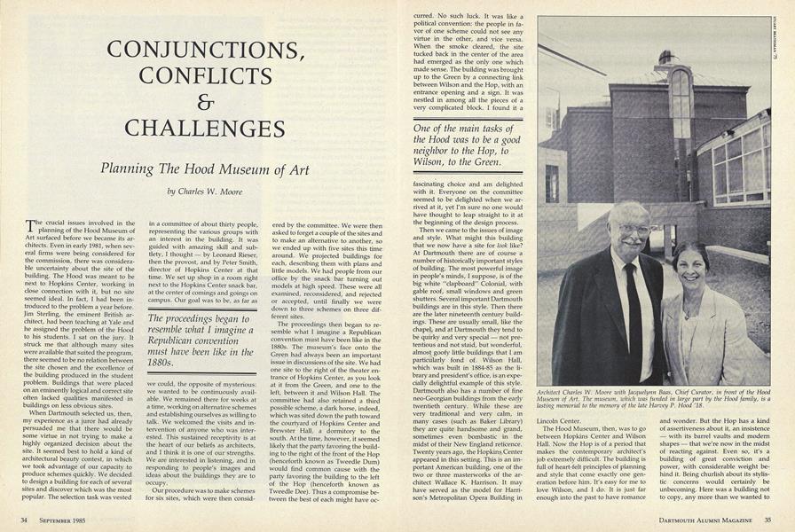
Architect Charles W. Moore with Jacquelynn Baas, Chief Curator, in front of the HoodMuseum of Art. The museum, which was funded in large part by the Hood family, is alasting memorial to the memory of the late Harvey P. Hood '18.
The proceedings began toresemble what I imagine aRepublican conventionmust have been like in the1880s.
One of the main tasks ofthe Hood was to be a goodneighbor to the Hop, toWilson, to the Green.
I wanted this museum tobe a series of rooms ofvery different proportionsand characters, where theart would not just appearin some anonymousmatrix, but have theopportunity to enjoy itsown environment.
By making interesting setsof shapes and spaces thatare attractive to movethrough and into, I thinkwe have allowed thebuilding to develop itsown special character.. .wehave sought somethingthat both supports andmediates between thefascinating buildings thatlie around it.
Charles W. Moore, author of numerous articles and books on architecture, has taughtat Princeton, Berkeley, and Yale. One of theleading figures in postmodern architecture,Dr. Moore headed the team that designedthe Hood Museum of Art at Dartmouth.
More From This Issue
-
 Feature
From "a few curious Elephants Bones" to Picasso
September 1985 -
 Feature
Journey's End: The Assyrian Reliefs at Dartmouth
September 1985 -
 Feature
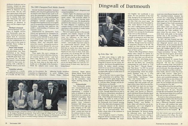
Dingwall of Dartmouth
September 1985 -
Cover Story
Back on the Wall (where they belong)
September 1985 -
 Sports
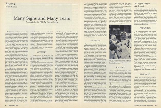
Many Sighs and Many Tears
September 1985 -
 Article
The Life of the Mind
September 1985
Features
-
 Cover Story
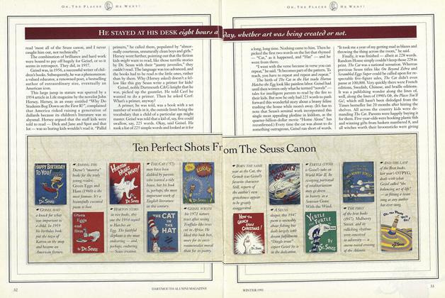
Ten Perfect Shots From The Seuss Canon
December 1991 -
 Feature
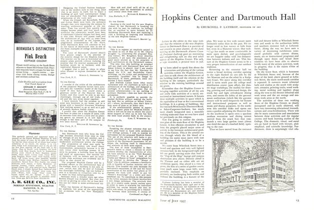
Hopkins Center and Dartmouth Hall
July 1957 -
 Cover Story
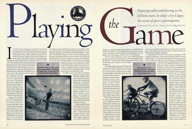
Playing the Game
March 1998 -
 Cover Story
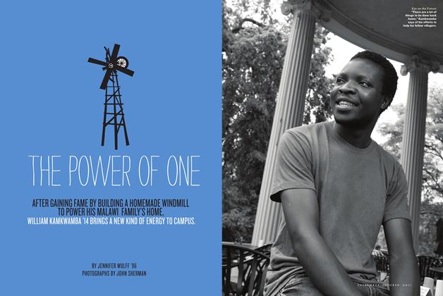
The Power of One
Sept/Oct 2011 -
 Cover Story
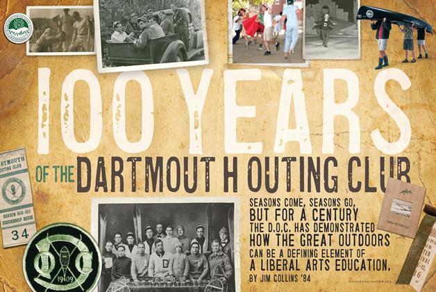
100 Years of the Dartmouth Outing Club
Nov/Dec 2009 -
 Feature
A Place In the Country
January 1975


