Artful posters
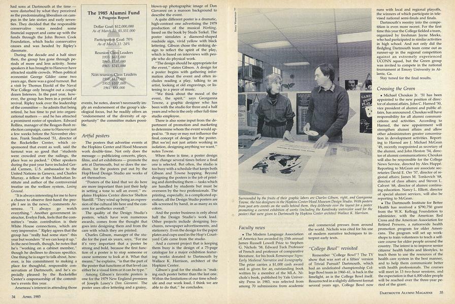
The posters that advertise events at the Hopkins Center and Hood Museum work double-time. Not only does the message publicizing concerts, plays, films, and art exhibitions promote the arts at Dartmouth, but so does the medium, for the posters put out by the Hop/Hood Design Studio are works of art themselves.
"Posters of the kind that we do here are more important than just their help in setting a tone to sell an event," explains Hopkins Center director Shelton Stanfill. "They wind up being an expression of the cultural life here and the concern for aesthetics overall."
The quality of the Design Studio's posters, which have won numerous awards, comes from the thought that goes into designing them and from the care with which they are printed.
Charles Gibson, manager of the studio for the past six years, says, "For me it's very important that a poster be strong and bold, because the first function of a poster is to stop someone or cause someone to look at it. What that means," he explains, "is that the part of the poster that functions at that level can either be a visual form or it can be type."
Among Gibson's favorite posters is one for the 1979 New England premiere of Joseph Losey's Don Giovanni. The poster uses olive lettering and a grainy, blown-up photographic image of Don Giovanni on a maroon background to describe the event.
A quite different poster is a dramatic, high-contrast one advertising the 1979 production of the musical Working, based on the book by Studs Terkel. The poster simulates a diamond-shaped roadside sign, vivid yellow with black lettering. Gibson chose the striking design to reflect the spirit of the play, which is based on interviews with people who do physical work
"The design should be appropriate for the event," states Gibson. A design for a poster begins with gathering information about the event and often includes reading a play, talking to an artist, looking at old engravings, or listening to a piece of music.
"We think about the mood of the event, the spirit," says Georganna Towne, a graphic designer who has been with the studio for three and a half years and who is the only other full-time studio employee.
There is also some input from the department of promotion and marketing to determine whom the event would appeal to. "It may or may not influence the final concept of design for the poster. [But we're] not just artists working in isolation, designing anything we want," notes Towne.
When there is time, a poster design may change several times before a final one is selected. But often, the studio is too busy with a schedule that keeps both Gibson and Towne hopping. Beyond designing the posters is the job of printing and distributing them tasks which are handled by students but must be overseen by the two professionals. The printing, especially, is a complicated operation; all the Design Studio posters are silk-screened by hand, in as many as six colors.
And the poster business is only about half the Design Studio's work load. Other projects include designing brochures, newspaper advertisements, and stationery. Even the design for the paper plates and cups used in the Hop's Courtyard Cafe came from the studio.
And a current project that is keeping them busy is the design of a 75-page catalogue for a major exhibition featuring works donated to Dartmouth by Wallace K. Harrison, architect of the Hopkins Center.
Gibson's goal for the studio is "making each poster better than the last one. Within the limitations of our time schedule and our work load, I think we are able to do that," he concludes.