Bibliographical Branding Irons
IN 1973, when it last took stock, the American Society of Bookplate Collectors and Designers had 152 members, which, for a nation of joiners, is either small beer or great exclusiveness. The professions of the members ranged from the expected (18 librarians, 8 artists, 6 calligraphers, 6 rare book dealers) to the enigmatic (1 quality controller, 1 freeway designer, 1 loss preventer, 2 unknowns). California had 31 members, while 21 states were quite unrepresented, though 9 foreigners belonged. And I know all this because 38 of the members were in- stitutions, including Dartmouth College (since 1924). The changes in Baker Library's bookplates over the years had begun to interest me, and since Baker offers promiscuous possibilities of research I had begun to poke around on the subject of bookplates. I can now report that there is a Great Institutional Bookplate Problem, hereafter known as the G.I.B.P. It doesn't have the wrench of world hunger or the snap of OPEC, but it has its points, nugatoriness being one of them.
Libraries and bookplates need each other, for in essence a library is a collection of books and the mark of collection is the bookplate. The earliest known come from the library of the Carthusian monastery of Buxheim in Swabia and date from the 15th century. Crude marks of ownership come and go - rubber stamps in alarming hues, pustular embossings, perforations which put the name of the library through the page like bird shot but the bookplate survives, for it alone does no violence to the idea of the book, but rather enhances it. A bookplate should be a work of art in itself; it should not only identify the owner of the copy but convey something of his character (and often it does so without the owner's consent or despite his intentions). These qualities make the bookplate collectible, if anything is needed to make something collectible in a world in which people collect barbed wire. The collections can be fascinating. Great artists from Dürer to Cocteau have designed bookplates, many famous and fascinating people have collected them, and their history is a record of the vanity, wit, changing taste, and infinite individuality of the clerisy. The British Museum has a quarter of a million bookplates (or exlibris) and Dartmouth more than 20,000, from J.P. Morgan's (gold embossed morocco) to Delores Del Rio's to one of the two known copies of Paul Revere's own plate. Yet browsing through the Dartmouth collection showed me why it was that Dartmouth's bookplates had me troubled; it was the G.I.B.P.
Americans are rarely armigerous, a fact which makes American bookplates, especially in the mass, more interesting to me than European ones. A coat of arms is a dear thing to its owner and a beloved thing to anyone of heraldic interests, but since the very function of it is to be a mark of identity and ownership, it is ready-made for a bookplate. And after I've looked at a dozen armorial bookplates, I've seen enough. An American individual commissioning a bookplate usually has no such short cut as the coat of arms and in consequence imagination is set free - to succeed or fail.
But institutions are not individuals, and libraries are institutions. Institutions have corporate dignity; corporate dignity demands coats of arms. Coats of arms claim the bookplate, and the bookplate is a bore. And it matters because a library which permits this to happen is missing the chance to exercise a benevolent patronage and to increase the aesthetic and human value of its books.
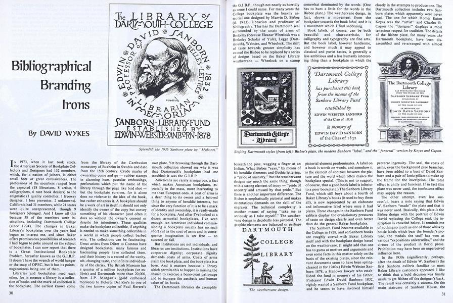
The Dartmouth libraries do exemplify the G.I.B.P., though not nearly as horridly as some I could name. For many years the College bookplate was the heavily armorial one designed by Marvin D. Bisbee (d. 1913), librarian and professor of bibliography. This has the Dartmouth seal surrounded by the coats of arms of Berkeley (because Eleazar Wheelock was a Berkeley Scholar of Yale), Legge (Dartmouth), Webster, and Wheelock. The shift of taste towards greater simplicity has caused the Bisbee to be replaced by a series of designs based on the Baker Library weathervane - Wheelock on a stump beneath the pine, wagging a finger at an Indian. What Bisbee "says," by means of his heraldic elements and Gothic lettering, is "pride of ancestry," but the weathervane designs say much the same thing, though with a strong element of irony - "pride of ancestry and amused by that pride." But there is another important difference. The Bisbee is emphatically pictorial and makes ostentatious demands on the skill of the engraver. The technical complexity is another means of saying "take me as seriously as I take myself." The weathervane design is decidedly less pictorial. The graphic elements are balanced or perhaps somewhat dominated by the words. (One has to hunt a little for the words in the Bisbee plate.) The weathervane design, in fact, shows a movement from the bookplate towards the book label, and it is a movement which I find saddening.
Book labels, of course, can be both beautiful and characteristic, for calligraphy and typography are fine arts. But the book label, however handsome, and however much it may appeal to classical and purist tastes, is generally a less ambitious and a less humanly interesting thing than a bookplate in which the pictorial element predominates. A label on a book is words on words, and somehow it is the element of contrast between the picture and the word which often makes the bookplate special. (This is not to suggest, of course, that a good book label is inferior to a poor bookplate.) The Sanborn Library Fund, which still buys about a fourth of Baker Library's books (it used to buy them all), is now represented by an elaborate and informative label where once it had plates. These changes in the Sanborn Fund exlibris display the evolutionary pressures of taste on design clearly and even better than do the general Baker bookplates.
The Sanborn Fund became available to the College in 1928, and so Sanborn books are roughly coeval with Baker Library itself and with the bookplate design based on the weathervane. (I might add that one has to guess at motives and arguments and even some facts in this matter solely on the basis of the existing plates, since the relevant documents seem to have been spring-cleaned in the 1940s.) Edwin Webster Sanborn 1878, a Hanover lawyer who established the fund in memory of his father, Professor Edwin David Sanborn 1832, rightly wanted a Sanborn Fund bookplate, and he seems to have involved himself closely in the attempts to produce one. The Dartmouth collection includes two Sanborn plates which apparently were never used. The one for which Homer Eaton Keyes was the "artist" and Charles R. Capon the "designer" displays a most tenacious respect for tradition. The details of the Bisbee plate, for many years the Dartmouth bookplate, have been disassembled and re-arranged with almost perverse ingenuity. The seal, the coats of arms, even the background pine branches, have been added to a bust of David Sanborn and a pair of lonic pillars to make up the frame for the inscription. The total effect is chilly and funereal. If in fact this plate was never used, the tombstone effect may supply the reason.
The other attempt, even less successful, bears a note saying that Edwin W. Sanborn "made" the plate and that it was never used. Basically, this plate is the Bisbee design with the portrait of Edwin David replacing the College seal; the inscription is crowded below. It reminds me of nothing so much as one of those whiskey bottle labels which bear the founder's picture, the medals the stuff has won at various "expositions universelles," and the virtues of the product in florid prose. Prohibition may have been an unperceived influence here.
In the 1930s (significantly, perhaps, after the death of Edwin W. Sanborn) the first Sanborn exlibris familiar to most Baker Library customers appeared. I like to think that a bold decision was finally made to get Bisbee off the designer's back. The result was certainly a success. On the main staircase of Sanborn House, the stark barracks of the English Department, is a bronze relief commemorating Edwin David Sanborn and the Sanborn family. It is dated 1936 and signed "Mahonri." The artist was Mahonri Mackintosh Young (1877-1957), sculptor and illustrator, and grandson of Brigham Young. The Sanborn exlibris by Mahonri is close kin to the relief, but I don't know which came first. It's a splendid design, and emphatically a plate, not a label. It conveys its information less rapidly than the latest Sanborn label does, dye to a marked individuality of lettering, but immediate legibility should not be an absolute desideratum in a bookplate. The Mahonri is immediately distinctive and yet contains rewarding detail. The rather bellicose profile head of "Bully" Sanborn (as a sculptor, Mahonri specialized in prizefighters), with its shrewd eyes and mouth, its cataracts of beard, and its rather touching low parting (to permit the ultra-careful combing of the hair over the baldpate) is the ikon of the Victorian father and teacher, the professor of belles-lettres. To replace it with a label seems a loss, but an action highly characteristic of our age.
The most powerful impetus moving libraries towards labels rather than plates is what I think to be a misapprehension concerning legibility. A book donated, especially as a memorial, will naturally carry the names of the donor and the person commemorated, and those names are given prominence by labels where there is no "distracting" pictorial element. This prominence, however, seems to me to be bought at the expense of enduring and distinctive impact on the reader. Except, of course, to the donor, all labels are eventually the same, and, paradoxically, your name is more apt to be remembered if it is associated with a pictorial emblem than if it appears prominently on a non-pictorial book label. For their own part, libraries know this and usually keep a pictorial element, even when switching to what is basically a label rather than a plate. Which brings us to the logo.
It is right that a library's bookplates should change from time to time, for they should be an effective record to the future of the taste and self-characterization of earlier generations. The manner in which the modern library bookplate is evolving does, I'm sure, reveal much about us, so to deplore it is probably futile. The library book labels of a modern designer, Edward Hampton Shickell, blending fine calligraphy and typography and an excellent use of color with a stark simplicity of overall design, reveal the direction of the trend. It is towards the stylized logogram, and there is no doubt that to a semiologist the logo says as much about our world as the Bisbee or Sanborn plates say about theirs. But the logo, however fine, means an end to the bookplate. It's back to the branding iron.
The special collections of Baker Library, however, do offer some hope. Separate collections and books bought from special funds have their own exlibris. Some are plates, such as the splendid one by Rockwell Kent for the Dirlam Fund, Stefansson Collection. This is based on a dust-jacket design by Kent. "As to the meaning of the design," he wrote to Peter Brackett Dirlam, "I think of the woman as expressing ... her joy at the return of the sun in spring - an event that is received joyously by all people living north of the Arctic circle" (or in the Upper Connecticut Valley, for that matter). Other special collections have labels, and some of those are outstandingly handsome, such as Rudolf Ruzicka's for the Evans bequest.
It is no accident, though, that the best plates and labels are found in collections of rarities, for the generosity of donors or the gratitude of the library often makes provision for a special exlibris for such gifts. But books bearing them do not circulate and are not seen by many readers. Books given for the general, circulating collections are usually marked with a variation of the standard weathervane label, and there are sound financial reasons for that. Many such gifts are necessarily of modest size; provision for a special exlibris would make a big dent in the sum given and the plate would appear in very few books. Yet there is one form of donation which could make a difference: the alumni memorial books program.
When Rufus Sisson of the Class of 1914 thought up the alumni memorial books program he created a form of giving which blends the personal and individual with the institutional and collective in a way which is perhaps unique. Classes which enter the program make funds available to buy books in memory of their deceased members. Their names are entered on the bookplates placed in the volumes chosen by the library, which often succeeds in finding books of special appropriateness to the alumnus' achievements and interests. Such books usually go into circulation.
Under the present arrangement, the alumni memorial bookplate is the same for all classes, a variant of the weathervane plate. Yet bookplates could, without a much greater burden of cost or difficulty, do far more to represent the collective but still very individual identity of particular Dartmouth classes and be a focus for the classes' pride in their attributes and attainments. The Class of 1976, for example, is the first to contain women members who entered the College as freshmen, a fact well worthy of commemoration. (The exlibris of the fund in memory of Robert N. Stevens '27 does mention the new Dartmouth Pine planted by his class, to cite one example of pride in class accomplishments expressed in this way.)
The designers themselves, moreover, could be found among the alumni. The annualnual exhibition of student art at Dartmouth is proof absolute that every class contains at least one member capable of designing a handsome bookplate. The originality of forms and materials displayed every year is astounding and could give real distinction to class bookplates. I've never yet seen an exlibris making use" of computer art, for instance, but I've seen striking computer pictures here. And to further emphasize that it is feasible, let me mention two student-designed bookplates now used in the Baker collections. The fine plate for the Don Quixote collection of Norman F. Page incorporates a drawing by James W. Hamilton '65, and the elegantly appropriate plate of the Class of 1926 memorial collection of New England illustrated books is by two students of Professor Ray Nash, Richard D. Grefe '67 and Stephan G. McKeown '70. By drawing on talent like theirs, the alumni memorial books program could do a lot more to enhance itself - and do something to help with the G.I.B.P.
Splendid: the 1936 Sanborn plate by "Mahonri."
Shifting Dartmouth styles (from left): Bisbee's plate, the modern Sanborn "label," and the "funereal" version by Keyes and Capon.
Shifting Dartmouth styles (from left): Bisbee's plate, the modern Sanborn "label," and the "funereal" version by Keyes and Capon.
Shifting Dartmouth styles (from left): Bisbee's plate, the modern Sanborn "label," and the "funereal" version by Keyes and Capon.
The weathervane design.
The "whiskey label" by Sanborn (left), a stylized logo by Shickell (center), and Ruzicka's design for the Evans bequest (right).
The "whiskey label" by Sanborn (left), a stylized logo by Shickell (center), and Ruzicka's design for the Evans bequest (right).
The "whiskey label" by Sanborn (left), a stylized logo by Shickell (center), and Ruzicka's design for the Evans bequest (right).
Above and below: plates for memorials and special collections in Baker Library.
Above and below: plates for memorials and special collections in Baker Library.
David Wykes, assistant professor ofEnglish, wrote about the Concord StringQuartet's residency at Dartmouth in theOctober 1975 issue. As a transplantedEnglishman, he has had experience withthe international aspects of the G.I.B.P.
More From This Issue
-
 Feature
For impact positive or merely benign our "sisters" seem to be Just Like the Rest of Us
November 1976 -
 Feature
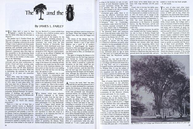
The and the
November 1976 -
 Feature
Five Deadly Threats
November 1976 -
 Article
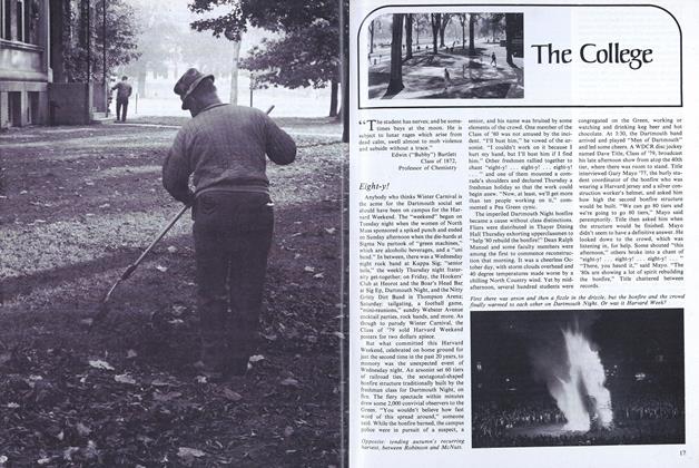
Eight-y!
November 1976 -
 Article
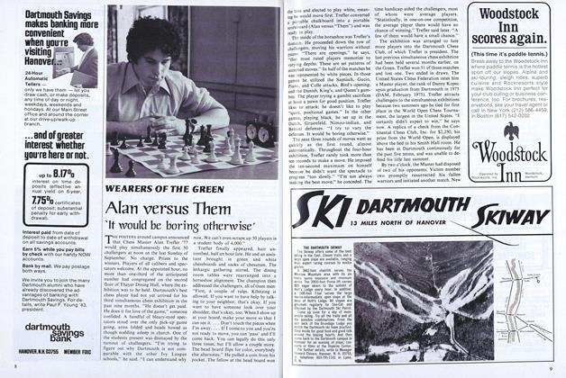
Alan versus Them 'It would be boring otherwise'
November 1976 -
 Article
Eleazar, Dan and Liz
November 1976