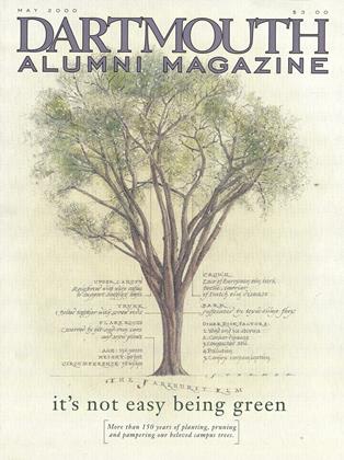
You Are Here
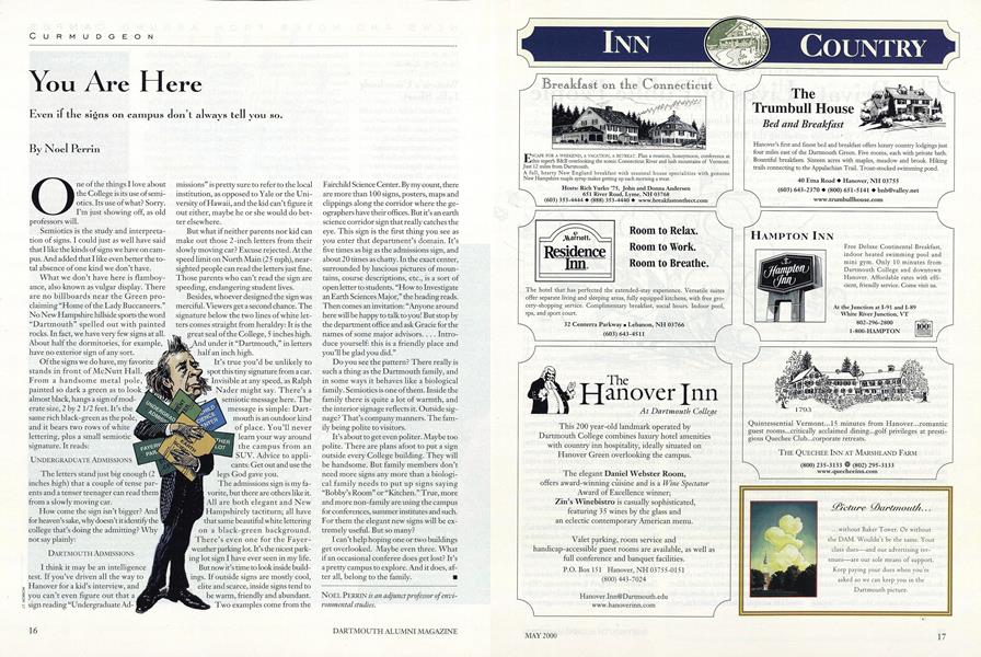
Even if the signs on campus don't always tell you so.
One of the things I love about the College is its use of semiotics. Its use of what? Sorry. I'm just showing off, as old professors will.
Semiotics is the study and interpretation of signs. I could just as well have said that I like the kinds of signs we have on campus. And added that I like even better the total absence of one kind we don't have.
What we don't have here is flamboyance, also known as vulgar display. There are no billboards near the Green proclaiming "Home of the Lady Buccaneers." No New Hampshire hillside sports the word "Dartmouth" spelled out with painted rocks. In fact, we have very few signs at all. About half the dormitories, for example, have no exterior sign of any sort.
Of the signs we do have, my favorite stands in front of McNutt Hall. From a handsome metal pole, painted so dark a green as to look almost black, hangs a sign of moderate size, 2 by 2 1/2 feet. It's the same rich black-green as the pole, and it bears two rows of white lettering, plus a small semiotic signature. It reads:
UNDERGRADUATE ADMISSIONS
The letters stand just big enough (2 inches high) that a couple of tense parents and a tenser teenager can read them from a slowly moving car.
How come the sign isn't bigger? And for heaven's sake, why doesn't it identify the college that's doing the admitting? Why not say plainly:
DARTMOUTH ADMISSIONS
I think it may be an intelligence test. If you've driven all the way to Hanover for a kid's interview, and you can't even figure out that a sign reading "Undergraduate Admissions" is pretty sure to refer to the local institution, as opposed to Yale or the University of Hawaii, and the kid can't figure it out either, maybe he or she would do better elsewhere.
But what if neither parents nor kid can make out those 2-inch letters from their slowly moving car? Excuse rejected. At the speed limit on North Main (25 mph), nearsighted people can read the letters just fine. Those parents who can't read the sign are speeding, endangering student lives.
Besides, whoever designed the sign was merciful. Viewers get a second chance. The signature below the two lines of white letters comes straight from heraldry: It is the great seal of the College, 5 inches high. under it "Dartmouth," in letters half an inch high.
It's true you'd be unlikely to spot this tiny signature from a car. invisible at any speed, as Ralph Nader might say. There's a semiotic message here. The message is simple: Dartmouth is an outdoor kind of place. You'll never learn your way around the campus from an SUV. Advice to applicants: Get out and use the legs God gave you.
The admissions sign is my favorite, but there are others like it. All are both elegant and New Hampshirely tactiturn; all have that same beautiful white lettering on a black-green background. There's even one for the Fayer weather parking lot. It's the nicest parking lot sign I have ever seen in my life. But now it's time to look inside buildings. If outside signs are mostly cool, elite and scarce, inside signs tend to be warm, friendly and abundant. Two examples come from the Fairchild Science Center. By my count, there are more than 100 signs, posters, maps and clippings along the corridor where the geographers have their offices. But it's an earth science corridor sign that really catches the eye. This sign is the first thing you see as you enter that department's domain. It's five times as big as the admissions sign, and about 20 times as chatty. In the exact center, surrounded by luscious pictures of mountains, course descriptions, etc., is a sort of open letter to students. "How to Investigate an Earth Sciences Major," the heading reads. Then comes an invitation: "Anyone around here will be happy to talk to you! But stop by the department office and ask Gracie for the names of some major advisors. . . . Introduce yourself: this is a friendly place and you'll be glad you did."
Do you see the pattern? There really is such a thing as the Dartmouth family, and in some ways it behaves like a biological family. Semiotics is one of them. Inside the family there is quite a lot of warmth, and the interior signage reflects it. Outside signage? That's company manners. The family being polite to visitors.
It's about to get even politer. Maybe too polite. There are plans afoot to put a sign outside every College building. They will be handsome. But family members don't need more signs any more than a biological family needs to put up signs saying "Bobby's Room" or "Kitchen." True, more and more non-family are using the campus for conferences, summer institutes and such. For them the elegant new signs will be extremely useful. But so many?
I can't help hoping one or two buildings get overlooked. Maybe even three. What if an occasional conferee does get lost? It's a pretty campus to explore. And it does, after all, belong to the family.
Noel Perrin is an adjunct professor of environmental studies.


Noel Perrin
-
 Letters to the Editor
Letters to the Editor
MARCH 1971 -
 Feature
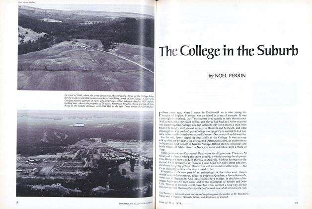
The College in the Suburb
May 1974 -
 Feature
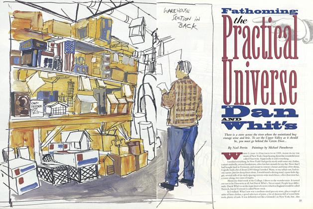
Fathoming the Practical Universe Dan and Whit's
April 1995 -
 Article
Oh, Professor, No Charge for You
APRIL 1996 -
 Article
The Difference With Oberlin
APRIL 1998 -
 Article
The Mystery of the Rising Electric Bill
JANUARY 1999